
Design Thinking
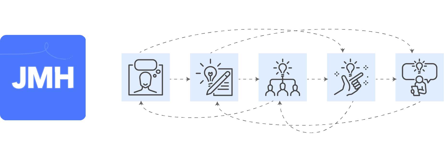
Design Thinking is a popular design methodology that cycles through five stages to provide solutions to complex and unknown problems. At a high level, following the system will enable you to achieve the best solutions by understanding your users’ needs, redefining the problems in a human-centered perspective, thinking of lots of possible solutions, creating an approach to easily test the ideas, and then testing them.
The kicker is this can be a linear process, but it probably shouldn’t be – and at any stage you can go back to any previous stage to iterate on the progress made. The best problem solvers are particularly skilled at knowing when to revisit a stage for an iteration.

Our Project: Journal My Health
We wanted to create a solution to help people with chronic conditions curb their symptoms. After doing initial research, we found that there was a need in the market for this idea, and COVID long haulers accelerated that need.
Our hypothesis was that if we were able to allow people to understand the variables involved in their chronic conditions, then they could adapt to live their best lives.

Stage 1: Empathize
The first step is to gain empathy for the people you are trying to help. This is typically done through consulting or observation.
We achieved this through a series of interviews with people with chronic conditions and physicians. By talking to the chronic condition sufferers, we were able to better understand their needs, daily routines, and concerns. If you’re lucky enough to not have any chronic conditions, then you probably don’t realize how limiting they can be. For example, one interviewee needed to lay down on the floor multiple times a day because of sudden extreme fatigue.
Talking to the physicians gave us their perspective and what they wish they knew about their patients. Also, we learned there was a problem that patients were often unprepared to talk to their physicians during appointments.

Stage 2: Define
Next is to define the problem or problems that you’re trying to solve for. Here you want to organize your findings from the Empathize stage, so that you can analyze and synthesize the core problems. It’s best to phrase the problems in a human-centered way, by putting people at the beginning of the statement.
We came up with three core problem statements:
- Chronic condition sufferers need an easy way to record their health and well-being, so they have a record to reference.
- Chronic condition sufferers need a way to interpret their health data in order to better understand their patterns.
- Chronic condition sufferers need an easy way to share their health story with their healthcare team, so they can think of a personalized plan together.

Stage 3: Ideate
Next you want to think of ideas that could solve your problems. Think of as many ideas as you can, then filter down to the best ones and refine them.
We wanted to give people the ability to find trends in their health and empower them to tell their health story. To achieve this self-advocacy through data, we decided on a mobile app that would allow users to:
- Record entries of their general health, symptoms, and treatment usage
- Analyze and compare their data
- Export and share their personalized reports

Stage 4: Prototype
Here you want to create inexpensive versions of your ideas, so you are able to test them. I said versions (plural) because by thinking of multiple ways to achieve the solutions, your team can discuss and decide which options are best, like in the Ideation stage.
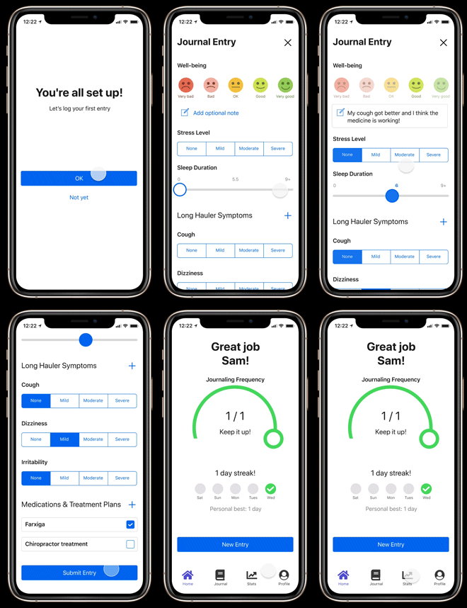
I created wireflows for us to work through, followed by clickable prototypes in Figma. We reviewed and reworked the prototypes until we had one that we felt was strong enough to test.


Stage 5: Test
This stage is pretty straightforward – test your idea! In most cases this involves testing your prototype with real potential users. You want to test with a representative sample of target users who are outside of your organization, so they are unbiased.
We tested the prototype with potential users to get a better idea of how they may interact with a real app. We used the feedback to refine the designs and keep testing. Finally, we agreed on a version that was ready for development, and we launched it on the app stores!

The Kicker
But remember that Design Thinking probably shouldn’t be a linear process! As we continued to talk with more potential users, we gained greater empathy for them and formed better understandings of their problems. Multiple times in the process we went back to a previous stage to think of different approaches to problems and solutions.
After we developed the first version of the app, we tested it with users to learn more about their needs and its usability. This sparked new potential features and highlighted limitations in the current design. For example, the Symptoms user interface pattern was often unintuitive to use, especially for users who increased their phones’ text size, so we redesigned it.
We also learned that integrating wearable and weather data was very valuable to users, but we needed to better demonstrate its value in order to get more users to allow the integrations.
We will continue to gather feedback and iterate on JMH as long as we own it.
Check out Journal My Health.
