While watching Avengers: Infinity War for the tenth time (I’m a bit of a fan), I had this realization: designing for accessibility not only helps those with special needs but when done properly it enriches the experience for everyone. I’ll explain…
In case you’ve missed the 20 plus Marvel movies released in the past ten years, they’re quite awesome, and I highly recommend checking them out. With the release of each movie, the Marvel Cinematic Universe is enhanced with details like nothing done before.

This rich development has left superfans (nerds like myself) wanting more. So this time around I decided to watch it with the subtitles on, thinking maybe I’ll pick up on some things I misheard or missed before.
From the very first shots of the movie, I instantly saw hidden details that I could not previously make out. The faint distress message from the Asgardians’ ship sets the stage for the scene: “The engines are dead, life support failing.”

The subtitles continued to unveil dozens of hidden details throughout the movie. Reading the spoken lines made me comprehend them in a new way, and I found an appreciation for overlooked dialog, like when Iron Man makes a witty jab at Drax saying “OK, Mr. Clean is on his own page”. The captions also present unspoken details, like that the telekinetic villain’s name is Ebony Maw and the name of the language spoken in Wakanda is Xhosa.
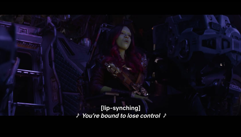
The Subtitles pointing out that Gamora is lip-syncing Rubberband Man made me think about them from the perspective of the viewers who could not hear the movie. I would be so confused without assistance in this situation.

That’s when it hit me, movies are no different than websites when it comes to accessibility. The subtitles provided a more enriched movie experience for all viewers in the same way as how ensuring designs are understandable for those with limitations makes a better experience for ALL users, superhero or not.
Accessibility in UX design is often thought of as designing for those with disabilities, but it should be the idea of designing for everyone. Accessibility is the cousin of usability because they go hand-in-hand in providing a better overall experience for all potential users.
Some basic practices for creating an accessible web UI are:
- Use large enough text sizes and color combinations. Putting small gray text on a gray background is not what we’re shooting for. (View contrast ratio testing tool)
- Write copy for links so that they can be understood without context. Screenreaders have the functionality to read through all of the links on a page. Writing a link as “View contrast ratio testing tool” is easier to navigate than “Click here to view contrast ratio testing tool”.
- Use more than color to convey information. If the only difference between a valid input and an invalid input is a red or green box, visually impaired or distracted users won’t notice the difference. Adding text to indicate the error helps to better identify the problem.
- Use header tags in the proper order. It sounds simple but is often overlooked. Screenreaders can list all header tags in order, and other users will scan headers for the content their looking for.

When following accessibility rules while designing you make more intuitive products and websites for even the most tech-savvy Tony Starks, knowledgeable Bruce Banners, and capable Captain Americas. Optimizing contrast ratios and using legible font families allows the Thors to focus on the content. Using information hierarchy and clear error messages let Black Panthers accomplish their tasks faster.

Don’t be a Thanos; design for everyone – doing so will make your designs stronger than a Hulk dose of gamma radiation.

For more on accessibility best practices, check out these articles:
5 Easy Ways to Make Your UI More Accessible
7 Things Every Designer Needs to Know about Accessibility
