Developer Poll
There is a lot of discussion about the value of design for end-users, and lately even about how companies utilize design to tackle challenges and achieve goals. However, there’s less out there about the impact that design can have for the rest of the team producing the product, specifically the engineers who are building it. We wanted to shed some light on this topic, so in April 2020 we conducted a simple poll with our own developers. Here are the results:
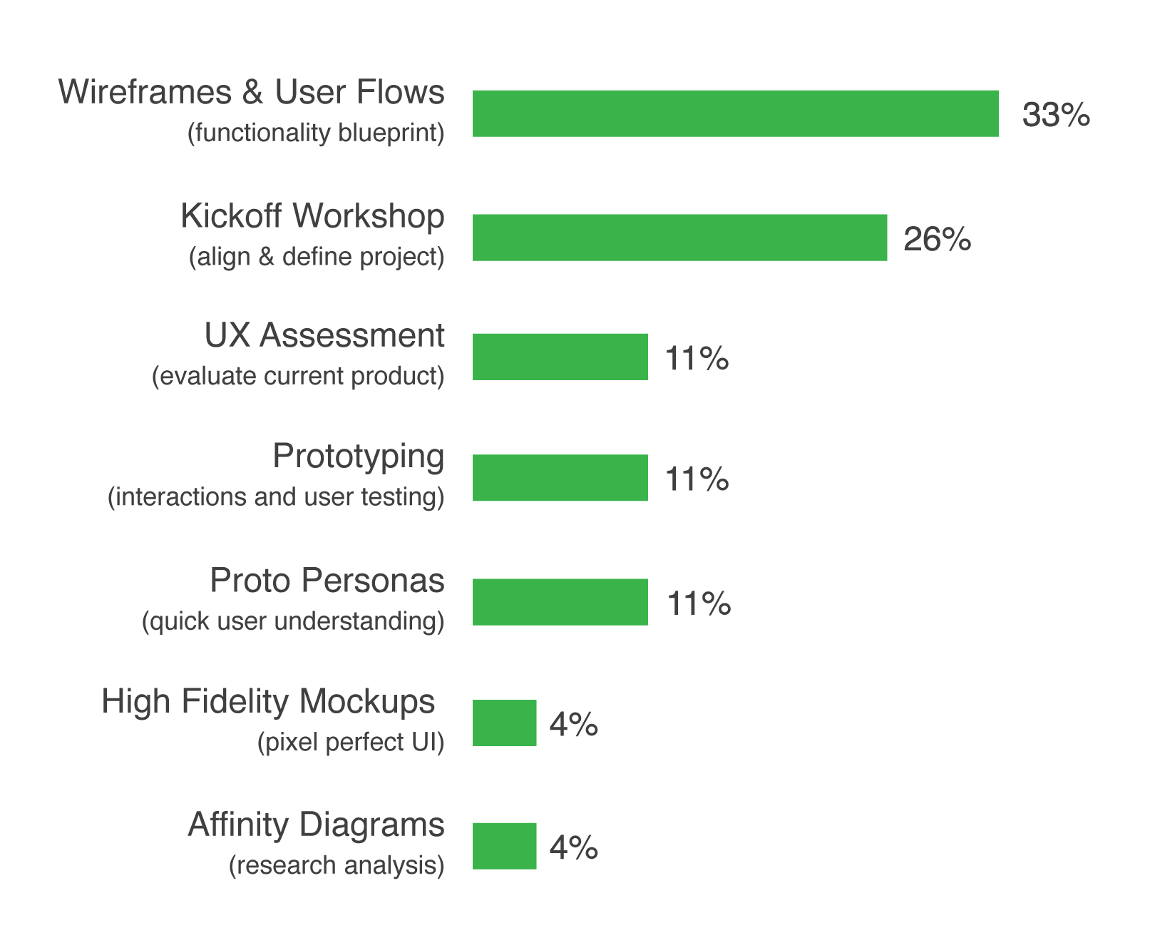
What design exercises do you wish were done on more of your projects?
| answer | description | percentage | ||
|---|---|---|---|---|
| 1 | (functionality blueprint) | 33% | ||
| 2 | Kickoff Workshop | (align & define project) | 26% | |
| 3 | UX Assessment | (evaluate current product) | 11% | |
| 4 | Prototyping | 11% | ||
| 5 | Proto Personas | (quick user understanding) | 11% | |
| 6 | High Fidelity Mockups | (pixel perfect UI) | 4% | |
| 7 | Affinity Diagrams | (research analysis) | 4% |

No surprise that the top choice was Wireframes & User Flows with 33% of responses, but we found it interesting that the second choice was Kickoff Workshop with 26%.
Interviews
The Interviewees

Consultant

Director of Training & Mentoring

Consultant
What are your biggest design-related frustrations?

Things go a lot better when design and engineering are on the same page. It’s frustrating when design is not involved early and often.

Being able to implement what I see and rolling out good design.

Projects that take a lackluster approach to design tend to have insufficient requirements and documentation.
What design exercises make your job easier?

I’m a fan of personas. It makes conversations about the software go a lot faster, and it makes telling the story easier.

Wireframes & UX assessment. If interactions are very complex, prototypes are very important. Kickoff workshops are essential. Also, proto personas so we’re trying to think like our user, and not just like developers.

Wireframes & user flows. Also proto personas, because when you walk in and someone has documentation to help you understand the roles of all the users and why they use the system, it’s much easier to get a grip on what it is supposed to do overall. It’s great for onboarding new employees to explain the product.
Does the project scope change what design exercises that you want?

For sure, basically everything on this list has its place. Kickoff workshops are great for bigger projects. Wireframes are needed every time.

Yes, if adding a small feature to an existing large project, we want to analyze how things are done already and do basic Lo-Fi wireframes (less of everything). If it’s a greenfield project, we want the whole schmear.

Yes. The majority of the projects don’t have the luxuries of a greenfield implementation, and stepping into an existing system changes the order of operations. You’d do a UX assessment for an existing product, which obviously doesn’t make sense in a greenfield.
Which design exercises make the final product better?

Mockups gives the product a professional and finished look that takes the guesswork out of it for engineers.

Everything depends; if we’re replacing an app, we need to assess the existing app to know why. Wireframes & user flows are so useful, it’s 90% of what we write code for. Hi-Fi designs are great to show the customer.

Wireframes & user flows because it keeps everybody’s eye on the ball. Hi-Fi mockups can create unrealistic expectations in terms of what the actual product can look like because you need a technical person next to the designer to make sure it’s possible.
What is design’s bottom line impact on the software?

Having a solid design practice in place enables developers to get the work done quicker; the requirements have been thoroughly thought through, and I don’t have to guess how things should look.

Having eyes on the project from a user experience perspective is the difference between writing the app “we were told to write” and giving the customer the app they actually will use and want. No matter what project, if it touches a human in some way, we need to do some sort of modeling of the interaction between the user and the system. These techniques really help us all gain a shared understanding as we begin to code the interface.

Many software projects fail because they build “a thing.” Usually the thing works “as designed” by the technical folk, but it just wasn’t “the right thing” for the users. Taking a design approach, in general, helps set everyone in the team up with the mindset of building “the right thing.” In the software development world, where almost anything is possible with enough time and resources, this can be the critical difference between success and failure.
Interview findings
The winner
Wireframes and user flows is an overwhelming favorite for good reason. They provide a functionality blueprint source of truth that acts as the visual requirements for the team to work towards.
The runner up
Kickoff workshops proved to be highly valuable to developers. These are essential for setting the tone of a new project by aligning all of the stakeholders and team members with a high level understanding of the project’s environment and goals.
The surprise
The interviews revealed that developers appreciate proto personas for telling the story and for understanding the users. This is great because it will allow developers to make decisions that will benefit the product’s users.
The rest
The other exercises have great impact on products, but are less valuable to developers. Mockups were debatable because they could cause headaches for developers who are expected to make unrealistic UIs. UX assessments are appreciated, but only if there was an existing product to evaluate. Prototypes were barely mentioned, and valued only if the interaction was very complex. Not a single developer brought up affinity diagrams, which makes me think they need more exposure to them.
My takeaway
While it’s great knowing which design exercises are most appreciated, my biggest takeaway is that our developers not only valued these design exercises as tools to make their jobs easier, but in a lot of cases they understood how they could improve the user experience and ultimately the product. Thanks again, Jack Lazorchak, Ken Rimple, and Matt Gilbride.
