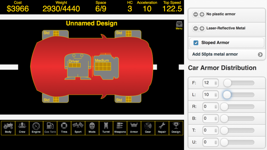
Recently I kicked off the redesign of a desktop/tablet Web application. It’s too big for a phone, but ought to work equally well for the other two. (Brace yourself for the content: it’s for designing futuristic cars-with-guns. 🙂 
The first step was selecting a JavaScript application framework. I chose AngularJS for the usual reason — it seemed to be hot and I wanted to try it for something more complex than a to-do list. It helps that this is a single-page application, which Angular supports well.
The next step was finding a component library — something that supports the screen layouts and UI widgets I want to use in the application.
In general, the app shows a large Canvas on the left 2/3 of the screen, with edit screens involving a lot of form-type widgets to the right: text inputs, checkboxes or toggle switches, single-select lists of options (which may be radio buttons or select lists or toggle button groups), sliders or range controls, increment/decrement buttons, navigation from screen to screen, and so on. 
In order to support tablets well, I was looking for something with a mobile-ish appearance: big controls that are easy to click on, list-style screen layouts where you can click anywhere in the “list cell” to operate a link or checkbox within, and that sort of thing. I only had the effort for one UI, and I felt like it would be worse to force tablet users to deal with microscopic desktop widgets and desktop-isms like navigation menus that pop up when you hover.
So with this in mind, I looked at some popular CSS libraries:
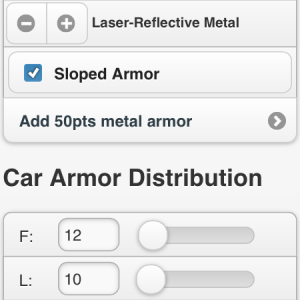
- JQuery Mobile: this is what I used for the prior version of the app (see the widgets in the images above). It gave me everything I wanted appearance-wise, but there were still some issues: overhead for processing my HTML into their HTML, some issues trying to restrict it to a subset of the screen, and the general paradigm of putting detailed logic into the controller to calculate and then manually apply changes to the DOM state. Looking back, my JQuery code was just plain bad, and I might be able to rewrite it to be more workable, but I wanted to try for something better.
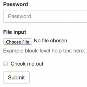
 Bootstrap: While this supports list-oriented UIs and has some hard-to-find elements of what I’m looking for like Button Groups, in general, it doesn’t do everything I’m looking for. See, for instance, the tiny checkbox in the example to the right. The radio buttons and select widgets are equally bad for fingers on a tablet.
- Topcoat: For starters, this project looks abandoned, with the last update about a year ago. It has some nice looking stuff like checkboxes and radios. But the list support is quite basic and doesn’t, for instance, handle links as list items by making them take up the entire space of the list cell and providing a visual indicator that the item is clickable. That’s a deal-breaker since there’s a lot of navigating from within one screen to the next.

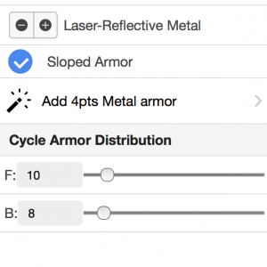
Ionic: I looked at using only the CSS part of Ionic, since tablet bandwidth is a factor and the JavaScript and Angular bits didn’t actually seem to add that much. Ionic has the list support I want, nice checkboxes and radios, and etc. The catch is platform support — the checkboxes, for instance, don’t render properly on Firefox (try the checkbox demo on both Firefox and Chrome). With some elbow grease, it can be made to work (for instance the JavaScript-processed checkbox demo works), but I didn’t really want a framework that required extra work or testing on my part.
I also briefly tried some combinations — using Ionic but with Topcoat checkboxes. That did not turn out to be a winning approach, as they both want to use CSS classes like “checkbox“.
Of these, I ended up going with Ionic CSS and elbow grease. It seemed like the best option overall. In another post I’ll talk about what I did to make Ionic work for me.
